
Lesson THEME: charts & graphs
A picture, so they say, will tell a thousand words. But what about a graph or chart?
A good graph or chart can show as much as several paragraphs of words. But how do you choose which style of graph to use?
The three most common are line graphs, bar graphs and pie charts. They are generally used for, and best for, quite different things.
You would use:
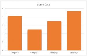
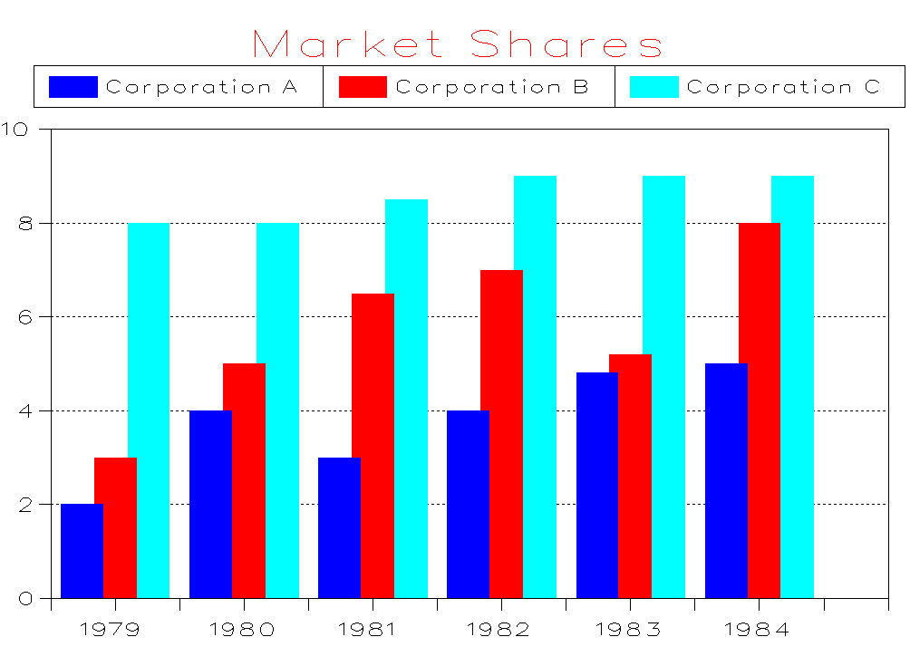
- Bar graphs to show numbers that are independent of each other. Example data might include things like the number of people who preferred each of Chinese takeaways, Indian takeaways and fish and chips.
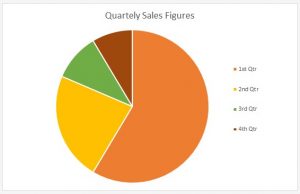
- Pie charts to show you how a whole is divided into different parts. You might, for example, want to show how a budget had been spent on different items in a particular year.
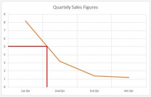
- Line graphs show you how numbers have changed over time. They are used when you have data that are connected, and to show trends, for example, average night time temperature in each month of the year.
Axes
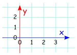
Graphs have two axes, the lines that run across the bottom and up the side. The line along the bottom is called the horizontal or x-axis, and the line up the side is called the vertical or y-axis.
- The x-axis may contain categories or numbers. You read it from the bottom left of the graph.
- The y-axis usually contains numbers, again starting from the bottom left of the graph.
The numbers on the y-axis generally, but not always, start at 0 in the bottom left of the graph, and move upwards. Usually the axes of a graph are labelled to indicate the type of data they show.
Activity 1:
Listening exercise
Listen to the following sound clip:
Activity 2:
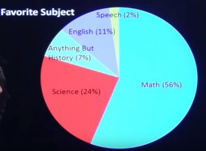
PICTURE
Describe what you see, in as much detail as possible.
Activity 3:
ARTICLE
Useful phrases to interpret a graph
As every graph tells a story, the creator has to be a good story teller. She or he needs basic knowledge in creating and interpreting the graphs produced. Also the person trying to understand the story, needs some basic knowledge about graphs. Otherwise reading a graph is like reading a text in a foreign language.
THE TOPIC
I’d like you to look at …
Let me show you …
Let’s have a look at …
Let’s turn to…
To illustrate my point let’s look at…
As you can see from these…
If you look at …
THE GRAPH
This graph shows…
The diagram outlines…
This table lists…
This chart represents…
This chart depicts…
This chart depicts…
This chart breaks down…
You’ll see/notice/understand…
Some vocabulary you need to know:
To go up: increase, rise, rocket, climb, lift, grow, go up, jump, surge, shoot up, soar, a rise, an increase, growth, an upward/rising/increasing trend, an improvement, extend, expand, push/put/step up, progression
To go down: decrease, drop, decline, fall, go down, slump, plummet, a downward/falling/decreasing trend
No change: Remain stable/constant/steady at, stay at the same level, stabilize, keep stable, hold constant
Indicating a change of direction level out/off, stand at, stop falling/rising, stop falling and start rising, stop rising and start falling, change
Frequent change: Fluctuate (fluctuation), volatile (volatility)
At the top: Reach a peak, reach its/their highest point
At the bottom: Reach/hit a low (point), hit/reach its/their lowest point
Activity 4:
Debate
A good graphical display is pleasing to the eye and therefore can have the effect of impressing the viewer and encourage them to read more of a page or site.
Do you agree – why or why not?
Take a stand point and defend your opinion.
Activity 5:
QuOte:
“We cannot just look at a country by looking at charts, graphs, and modelling the economy.
Behind the numbers there are people.”
“
Please explain what your understanding is of this quote.
Do you agree or disagree with it? Why or why not?
Activity 6:
PHRASAL VERBS:
Phrasal verbs open up a whole new world of possibilities for speaking English. They are phrases that give verbs completely different meanings. They are also used often in everyday conversation, which makes them important to know.
- We must focus our attention on …
- What I suggest is …
- There is a necessity for …
- We need more …
- We have no choice but to …
- Appropriate measures must be taken
- The only option we have is to …
- These changes are inevitable.
- We will have to revise our estimation.
- The result / outcome will be …
- I strongly recommend …
- To conclude, I am happy / I regret to announce that …
Activity 7:
Homework:
- What do you do over weekends, and how much time do you spend on each activity? Draw a pie-chart to show your results.
- What percentage of your income have you spent on accommodation over the past 3 years? Represent your results in a bar chart.